Move Fast,
Stay Consistent
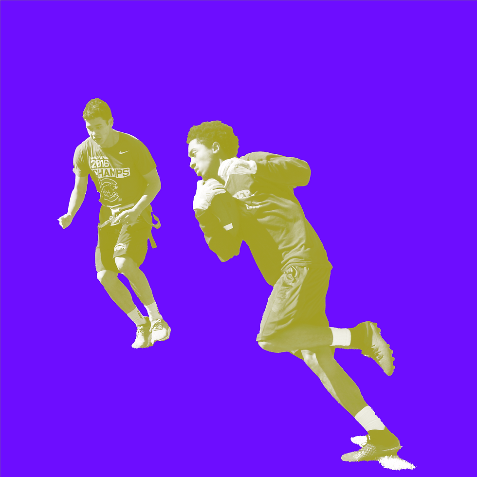
Rebranding Georgia State University's recreation centers meant delivering polished, cohesive visuals across group fitness and intramurals all on a tight timeline.
Maintaining visual consistency across two distinct recreation programs with different audiences and energy.
Executing a full branding rollout quickly without sacrificing quality or attention to detail.
Unifying group fitness and intramurals under one cohesive identity while letting each program retain its own personality.


Made With Human Hands, Robot Brains, and One Too Many Adobe Tabs Open
This project was a group effort — if by "group" you mean one human, a few robots, and an unhealthy amount of Adobe CC. Claude and a handful of other AI tools were consulted for research and wireframing (they had opinions; most were ignored). Figma handled design and layout, because some of us still like to feel in control. Adobe Creative Cloud did the heavy lifting on typography, layout, photo editing, and mockups — as it has, loyally and expensively, for years.
© 2026 by Sluggo Creative